Responsive Web Design in Bury St Edmunds, Suffolk

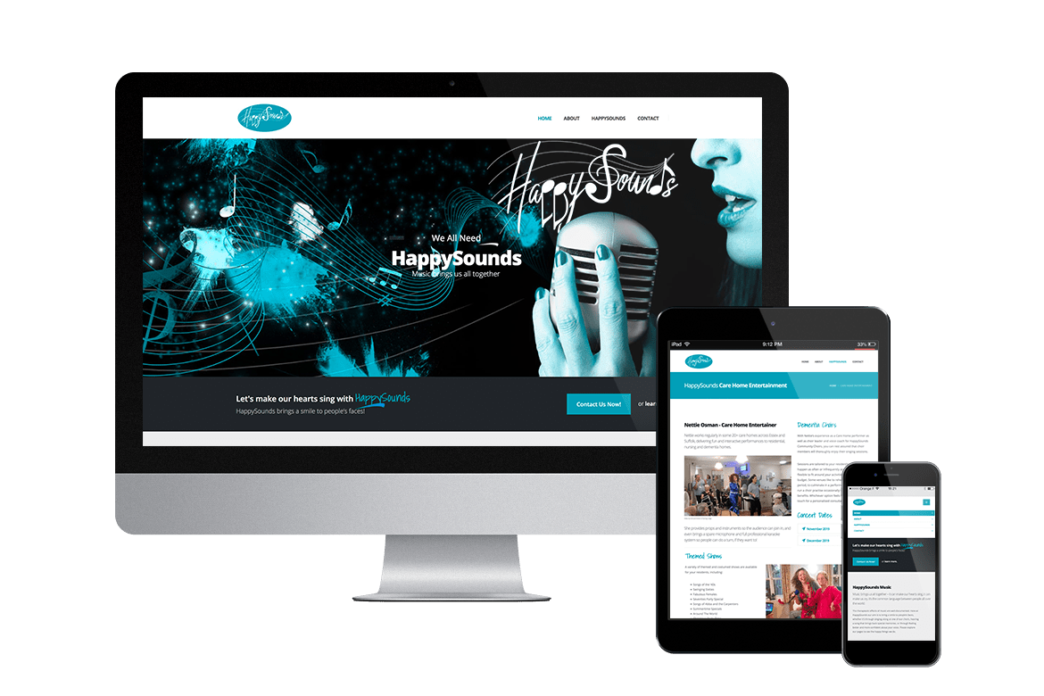
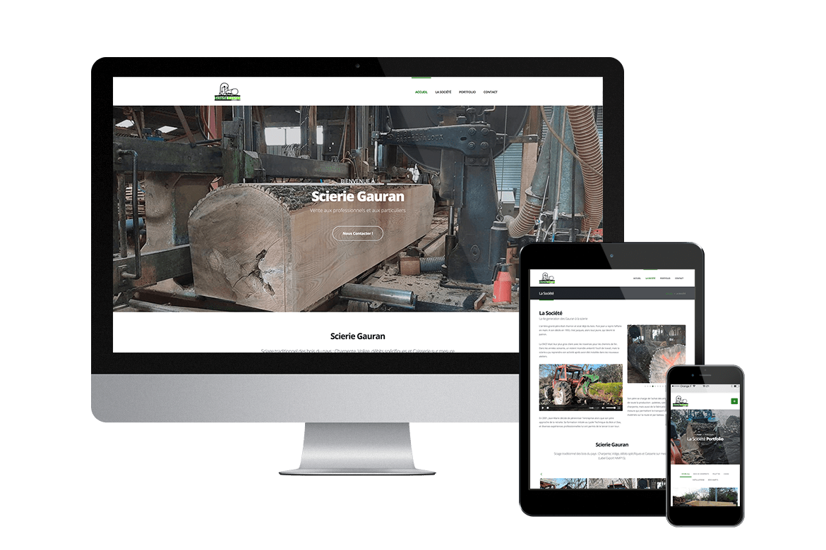
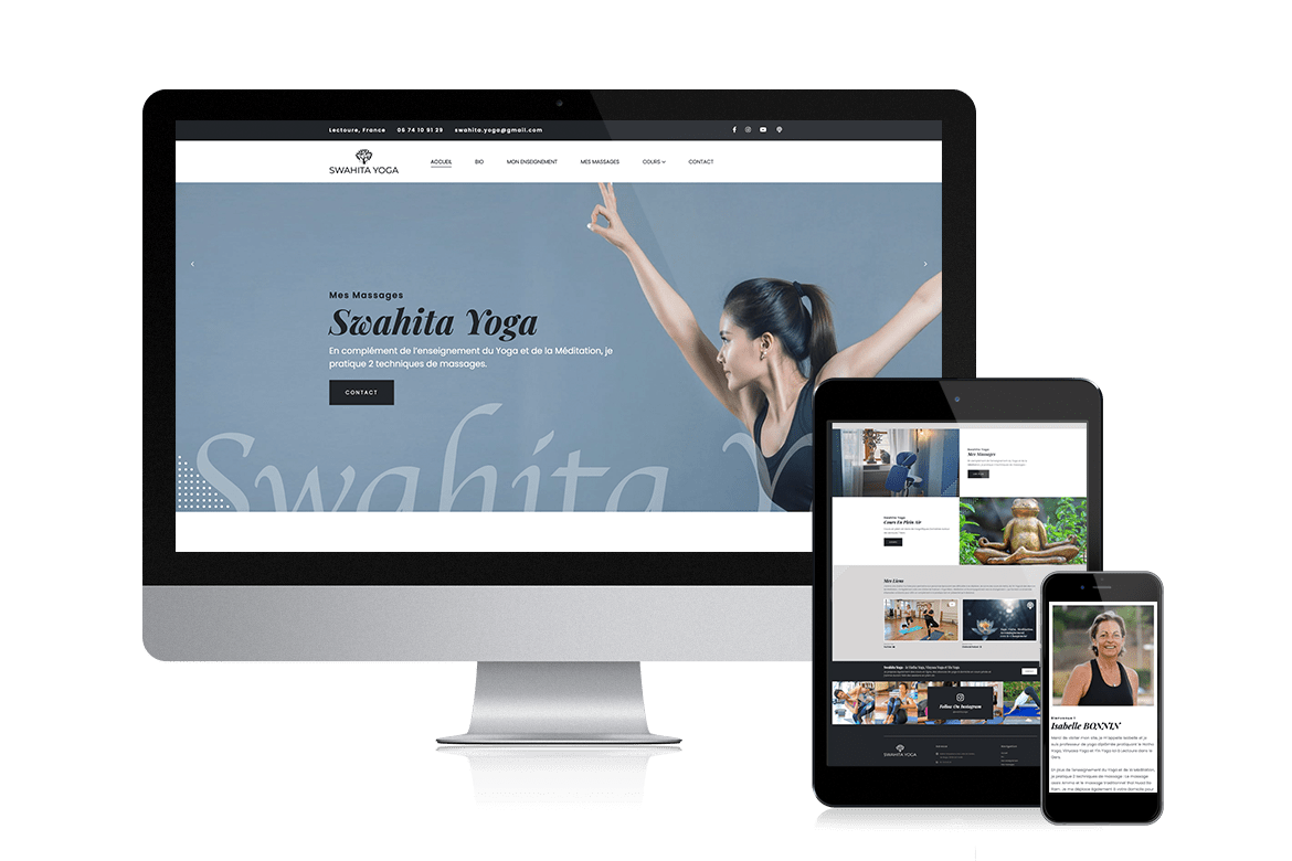
Responsive design ensures that websites provide an optimal viewing experience across all devices, from desktops to smartphones. All our sites conform to this standard, adapting content to fit various screen sizes for enhanced usability and accessibility.
Responsive Design
In today’s digital landscape, having a website that looks great and functions seamlessly across all devices is essential. Responsive design is an approach that ensures your website provides an optimal viewing experience, regardless of whether it’s accessed on a desktop, tablet, or smartphone. At Magellan Design, we specialise in creating responsive websites tailored to the needs of businesses in Bury St Edmunds and throughout Suffolk.
What is Responsive Design?
Responsive design is a web development technique that uses flexible grids, layouts, and CSS media queries to adjust the website’s content according to the screen size and orientation of the device being used. This means that images, text, and navigation elements resize and reorganise themselves to provide a user-friendly experience, no matter the device.
Why Choose Responsive Design?
- Improved User Experience: A responsive website enhances user experience by ensuring that visitors can easily navigate and interact with your content. Whether they’re browsing on a large desktop screen or a small mobile device, your website will adapt to their needs.
- Better SEO Performance: Search engines like Google prioritize responsive websites in their rankings. By providing a single URL for both desktop and mobile versions, you eliminate duplicate content and improve your SEO efforts. At Magellan Design, our responsive websites are optimised to help you rank higher in search engine results.
- Cost-Effective Solution: Maintaining separate websites for desktop and mobile can be costly and time-consuming. Responsive design eliminates this need, allowing you to manage a single site that caters to all users, saving you both time and money.
- Future-Proofing: With the rapid advancement of technology and the increasing variety of devices, responsive design ensures your website is adaptable to future devices and screen sizes. This means your investment in web design remains valuable for years to come.
Our Approach to Responsive Design
At Magellan Design, we understand the importance of responsive design for businesses in Bury St Edmunds and Suffolk. Our team of experienced web developers employs the latest techniques and best practices to create websites that not only look great but also perform well.
- Custom Solutions: We believe in crafting unique, tailored websites that reflect your brand’s identity and cater to your specific business needs. Each responsive website we build is designed to engage your target audience and drive conversions.
- Thorough Testing: We rigorously test every website across multiple devices and browsers to guarantee a consistent experience for all users. This commitment to quality ensures that your website performs flawlessly, regardless of how visitors access it.
- Comprehensive Cross-Compatibility: Testing is conducted on all major browsers such as Chrome, Safari, Firefox, and Edge, as well as on a variety of mobile devices. This ensures that your site is fully functional and visually appealing on any platform.
- Staging Environment: Before your website goes live, we provide access to a staging site. This allows you to preview and interact with your website as if it were live, giving you the opportunity to provide feedback and request adjustments.
- Seamless Launch and Training: Once testing is complete and you've approved the staging site, we proceed with the launch. To ensure you're fully equipped to manage your new site, we offer comprehensive training on our web applications key functionalities. This empowers you to confidently handle updates and maintain your site with ease.
- Understanding and Planning: The journey begins with a conversation about your website needs. We outline a broad strategy and offer an estimated budget to set expectations.
Next, we dive deep into understanding your business goals and audience. This phase is comprehensive, as we collaborate with you to flesh out website specifics. We infuse our expertise by recommending ideas, defining phases, and exploring optional features. This culminates in a clear, formal proposal. - Creative Design and Development: Our design phase focuses on creating detailed visual mockups for your homepage and other essential pages. Once you approve these designs, the development team takes over to bring the vision to life.
Special attention is given to optimising the site for both speed and SEO, ensuring your new website stands out and performs exceptionally well in search results. Additionally, compliance with regulations like GDPR and robust security measures are priorities throughout the build.
- Testing and Launch: Before going live, we rigorously test your website across all major browsers and devices, confirming compatibility and performance. You'll have access to a staging site, where you can preview and verify every detail before the official launch. Once you’re satisfied, we launch the site and provide comprehensive training on the site's functionalities.
- Continuous Improvement and Support: Our services extend beyond the launch. We offer a range of support options to keep your website running smoothly:
- Website Care Plans: These include hosting, routine updates, optimisation, and security enhancements.
- Website Optimisation Plans: We focus on ongoing SEO and performance improvements to increase your online visibility and drive better results.
Get Started with Magellan Design
If you’re looking to enhance your online presence with a responsive website that caters to your audience in Bury St Edmunds and Suffolk, look no further than Magellan Design. Our expert team is dedicated to providing high-quality web solutions that meet your needs and exceed your expectations.
Contact us today to learn more about our responsive design services and how we can help your business thrive in the digital age!
Over 20 years of experience building secure, scalable websites.
Get a Custom Website or Laravel Development Quote Today!